August 20, 2015

Process Video + Scraptastic Kit

Nancy Damiano // The Paper Orchard. Process Video

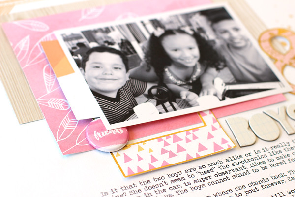
KIT | Scraptastic July Kit 

STORY |  I made this layout to document a seasonal tradition. At the start of every summer,  I make my  entire family ride the flying swings. Some go more willingly than others. I don’t have to force the kids, it’s the adults that give me lip.

FlyingSwingClip

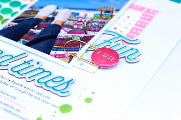
Our first trip to the boardwalk and this ride mark the beginning of the season. This time I was able to capture that tradition with a flying  iPhone shot. Luckily I didn’t lose the phone and captured this great picture of my shoes over the boards. The colors in the photos + the candy colors in the kit went together like PB&J.

VIDEO | Take a look at the video to see how the design process came together:


I was able to highlight my favorite part of the kit – those big, colorful dots. Keeping the design on the clean and linear side compliments the photo + the ‘stuff’.  And that’s where I’m happiest creating.

August 17, 2015

Process Video + Simple Stories

As summer starts to come to a close, I find myself looking through vacation photos and feeling nostalgic. Last year our entire family got together and rented a beach house in Ocean City, Maryland. 8 adults, 3 kids and 2 babies under two in one house. Can you say cray cray? This was my husband's idea of relaxation so I just drank coffee and went with it.
OC3


I used the 4x6 SN@P! binder album in a bright, sunny yellow. It's filled with page protectors in 3x4, 4x4, 4x6 (divided) sizes, blank ledger pages and chipboard yellow dividers. 

Take a look at the video to see how it all came together (and please subscribe to my YouTube channel for more inspiration!):


Here's a closeup of some of the details. I used a 4x6 transparence from the Summer Vibes Collection Pack to create a divider. 
OC1

These pages came together really quickly. I limited the supplies to chose from and went for a cleaner, but still layered look. The pops of color and fun icon in the line keep it from looking to plain.

Here's to celebrating summer, big family vacations,  and mini albums!

August 7, 2015

My Mind's Eye On Trend + Favorite Eats

Pattern8

COLLECTION | My Mind’s Eye On Trend
STORY BEHIND THE PAGE | I was going through my California trip photos when I came upon this imperfectly perfect shot. I had just enjoyed my favorite meal of the trip, Pollo Fundido at Casa Guadalajara in Old Town, San Diego. This dark photo brought me right back to that time and place. Sitting on the quaint patio with its twinkling lights, fountain and mariachi band playing in the background. Sometimes it those technically not great photos that capture the best, simple memories.
Pattern9
DESIGN |  The On Trend collection by My Mind’s Eye is all about generic stripes and dots with splashes of mint, pink and orange. I chose it because the pale colors set off the very dark photo. It has just the right amount of pop and festive (in the colors and polka dots) to set the stage.
I kept this design very simple with just two major areas of layering. The first is the background made up of vertical strips of patterned paper layered on a horizontal stripe background. Next, a bed of layers to make the photo pop were created with a polka dot transparency, chipboard frame and tag.

SUPPLIES | My Mind's Eye On Trend | Avery Elle Inks | Epson Wide-Formant Printer

August 5, 2015

Scraptastic Kit + Amy Tangerine

Every month as soon as I get my kit, I pick out my favorite things and make it a goal to use them. The first thing I set aside this was the sticker sheet from Amy Tangerine’s Rise and Shine collection. I am not so great with the watercolors so I'm glad that Amy is.

the stuff | scraptastic kit club May kit + Amy Tangerine Rise & Shine

BoysGirlstag

the story | The photo is one I took on vacation last year of my son, niece and nephew. When I wrote the journaling I was looking at the picture and thinking that they are so alike in some ways and yet so different. Is it a personality thing or gender? 

BoysGirlDet
Here’s a closeup of my favorite sticker. I used it almost like a photo corner in the bottom right of the design. It frames out the journaling and creates a diagonal line from the photo.


BoysGirlsDet2
Cutting up patterned papers and layering them with flair and frames from the kit  draw attention to the photo. It's a pretty bed of layers for the focal point. 

I like all of the elements in this kit. It's not a combination I would naturally gravitate towards and that's exactly why I like kits. They let me stretch creatively (in a good way).