November 24, 2014

Scraptastic November Kit + Maggie Holmes Open Book

My goal this month was to design two layouts that were radically different with the November Scraptastic kit. At first look, the Shake it Off kit has a very soft, feminine feel to it. I started at that jumping point and chose to highlight this photo of my niece at the Bippity Boppity Boutique in Disneyland. It was my favorite shot from our trip – the look on her face is just priceless!


The intricate design of the wood veneer complemented the ‘fancy’ feel of the photo. I painted it with a thin coat of watered-down, white acrylic paint so it wouldn’t steal the spotlight from the photo. It is that beautiful! I also thought it would be the perfect “o” to my “xo” title. The idea for that came from the rub-on on the side of the photo that reads: ‘I love everything about this’. I do and I wanted that sentiment to be front and center.
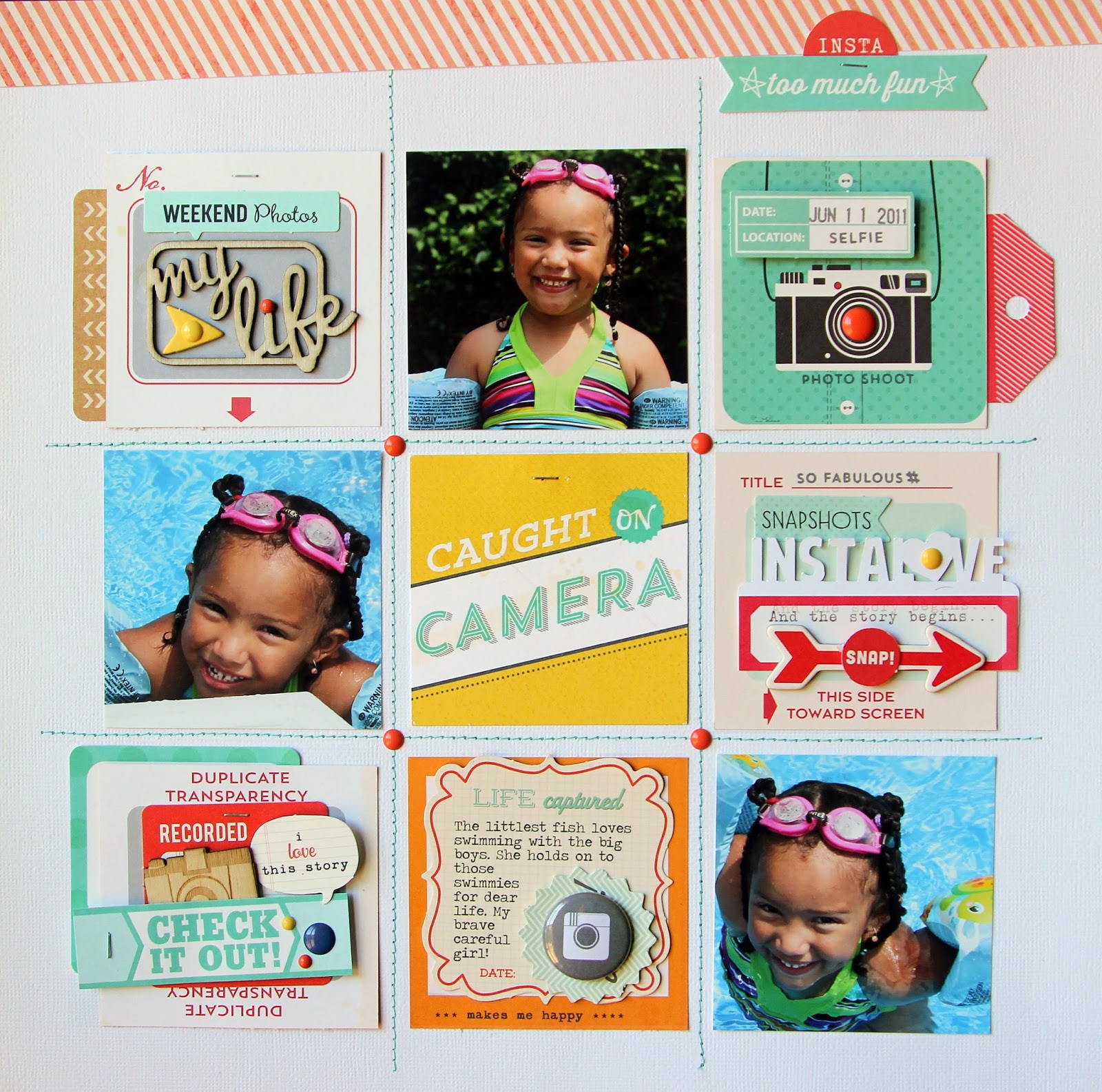
My challenge here was to go with a bold palette, use at least 3 photos and a tiny title. The complete opposite of the “XO” page. The kit has so many versatile patterns and colors that it was easier to do this than I had anticipated.
First, I picked out the heart patterned paper and two coordinating cardstock colors. Then I laid out the photos in a grid design adding a spot for journaling. Next, Iayered a small veneer title, die cut card and embellished tag for pops of color and dimension.


The finishing touch came at the end with the three layers of triangle photo corners in the lower left side. Stitching the edges, using two different patterns and stacking them gives this area of the layout weight and that something ‘special’ detail. On the opposite corner, I used the patterned heart paper to balance the design out.

November 21, 2014

Simple Stories Life Documented Planner: Here We Go!


Here it goes, I’m jumping into the planner craze! If you have no idea what I’m talking about, Google “planner addict” and you will see!
I knew this was something I would love. I’ve kept many planners over the years, but stopped in favor of the iPhone a while back. There’s something about seeing all of my plans and ideas on paper that I have really missed. Add stickers, organization + colored pens and this stationery loving girl is sold. Plus, every once in a while I peek at my old planners and it’s nice to see what my life was like as a college student. It’s a time capsule that makes me smile. My priorities and to-do’s have changed radically.

The Simple Stories Life Documented planner collection is perfectly bold, colorful and graphic – just my style! Watch this video if you’d like to see how I set up my planner and how I will be using it:


Happy planning!

November 5, 2014

Scraptastic Heart it Races Kit


This month I've been working with the Scraptastic Heart it Races Kit and Add-On. I chose this set to work with because I love all the bright colors and graphic feel. It can be used for so many different types of pages and that's what I tried to do this month - a mix of every day, vacation, girl centered and neutral layouts.


This file folder paper from Maggie Holmes latest collection is one of my favorites. I cut it up here and used it to balance out a enlarged photo from my son's birthday party. The story is about our tradition of gathering the balloons and doing a release at the end of all his parties. It's one of my favorite moments and I was lucky enough to have this picture of it.
This page was built around the colorful "paint swish" paper from Chickaniddy's Scrumptious collection. I thought it would make the perfect backdrop for some of our Disneyland photos. This one is the moment the kids first hit Main Street in all their silly glory.
The last layout was created around another favorite pattern - the stacked titles in this bright Studio Calico paper. It gave me a great girl palette to work with. The story here is about just that - the little girl in our lives and how even in the midst of boy centric Legoland, she finds the brightest pink girl spot.
Three very different pages all created with one kit. That's what I love about Scraptastic and how they put things together. The kits are packed and the palettes work with all types of photos. Makes my life easier for sure!


September 24, 2014


Earlier in the month I was tagged by one of my favorite scrapbookers, Kim Jeffress to participate in the Scrappy Blog Tour. And I failed big time. Back to school, a last minute vacation, football and life just rolled into one big time sucker and blogging took a hit.  I made time to create (because I have to or I’ll die), but writing – not so much. Then time goes by and I’m not sure where to start or what to say. So I decided to begin with a simple Q&A from the hop. I can do that.

1.       What are you working on now? 
      A magazine cover project, a Disneyland page and project life for September. This is what my desk looks like right now:


2.       How long does it take to create a project?  
       2-3 hours usually. But I’ve also taken days. If something is not working, I’ll set it aside and start on another project until I figure out what’s not working.

3.       What are your favorite things to create with right now?  
      Acrylic paint (inspired by Wilna Furstenburg especially), the Shimelle collection and the monthly kit from Scraptastic. This is a peek at some of the things I've bought this month:

4.       How does your creative process work?  
      My pages usually begin with a story and the I find the product to support it. That’s my favorite way to create. Most of my kit club pages begin like this. But when I work for a manufacturer or a magazine, then it’s usually product first and then matching a story to it. This is definitely more difficult but I like the challenge (most of the time).

5.       How do you become inspired and stay inspired?  
       Little doses of Pinterest, but not too much or I just get crippled with sensory overload. And color. I love working with color.

6.       What is your signature style?  
      This is a hard one, because I don’t think I have a really defined style. I like clean lines and bold colors. I like to try to meld current trends with those two staples and that makes me happy!

7.       Who inspires you?  
      I have an eclectic group of favorite scrappers. Jill Sprott, Wilna Furstenburg, Shimelle, Kim Jeffress,  Mel Blackburn, Leanne Allison, Melissa Mann, Nicole Nowosad, and Susan Weinroth.  Each one for a different reason. Some for their words and smarts, some for their photography and style and some for their artsy souls. I have a long list, but those are the first ones that came to mind.

Thanks Kim for nominating me! Maybe this will pull me back from the world of Insta and back to blogging regularly.

August 15, 2014

Diagonal Love

Sometimes I find myself following a diagram of sorts when I start a page. A design that I've done over and over again comes naturally, but sometimes I get bored. That's when I know it's time to shake things up.

Creating on a diagonal line is not new, I've seen it all over Pinterest. But it's new to me and it was a challenge to put my own spin on it. I kept super clean lines, bright colors and a line of stamping to make it my own.
This corner cluster started with the two small photos and then I just kept building out until I reach the corner of the page.
I continued the layer on the opposite side with larger pieces. My favorite is this colorful, hexagon print transparency from American Crafts.
All of the items on this page are from the July 2014 Scraptastic kit Summer Nights. The photos, the kids and the story are all mine. :) 


August 8, 2014

In the summertime....Simple Stories + Scraptastic

I've gotten so many ideas and pages from the Scraptastic's July Sail kit. I'm not sure if it's the cool nautical vibe or the fact that I'm desperately trying to hang on to what's left of summer. 

It seems like we just came back from California and I love looking back at these pictures. One of our favorite days was a very laid back afternoon on Mission Bay. The kids chose to rent a speedboat instead of going to the zoo. I think they were all theme parked out. 
I love everything about this sticker (the colors, the icons, the text) and I was determined to work it into the design. Adding a circle of handstitching and some random stickers, sequins and a date stamp give some lift to the flatness of it.
 Layers of patterned paper gave me a pop of turquoise and a shelf to put the title on. I used a little swipe of turquoise paint on the white wood background to soften the edges of the linear design.
This page speaks to me. It highlights pictures that make me smile, a good memory and pretty layers of paper. It doesn't get better than that for me!

July 26, 2014

Painted Backgrounds

This picture of Nico makes me laugh, it so him. Laid back + funny + waiting on the world to cater to him. That's my kid. The sole picture tells the story perfectly so it's all I needed. That left we with a lot of space to get creative. I started the canvas by brushing some acrylic paint on the white background to match the aqua in the photo.
 All of the things I used on this page came from Scraptastic's July Sail kit. While it has a definite nautical theme, it also includes a lot of pieces that can be used for telling any story.


 The circle die cut is the perfect place to add little bit and pieces. I love details - they're one of my favorite things to design.
I cut up strips of aqua paper and layered them under the photos and embellishments. This adds a layer of texture and shape to the base. I used Staz-On ink to stamp on the painted background.


The paint anchors everything on the layout. It made putting the rest of pieces together easy and highlights the photo. Layers of tags by Scraptastic and a journaling card from Carta Bella add just the right punch of bright color.

July 16, 2014

Marco Island meets Scraptastic Ki

DESIGN NOTES:  I was recently sorting through a big pile of layouts, putting things away when I came across this layout created not so long ago with the Worth Wondering kit over at Scraptastic. It's based on a sketch that the team worked with in April. I love that we get to work with sketches, it frees me up to concentrate on color and embellishment and less on figuring out how things are going to fit together. My favorite part (other than the photos) are the stitched circles. They add movement, texture and ground all the important elements of the design.
THE STORY:  I can't believe it was almost exactly one year ago that I was taking in this view from our balcony. Marco is an idyllic little place located on the Gulf of Mexico with white sand beaches and turquoise waters. This was a very laid back, relaxing vacation for us which is unusual for us, but sometimes so very needed.
All of these pictures were taken with my iPhone. The vacation was so relaxed that I couldn't even be bothered to take out the heavy DSLR. It was risky, but I'm happy with the shots that I was able to get. I liked them so much, I made this mini and video for 2Peas last July:


Here's a process video that explains how to organize, sort and scrapbook vacations in a mini album format:


July 8, 2014

Bella Boulevard

Back in May I was asked to be a guest blogger for Bella Blvd. I was excited, because I love color and Bella does it really well!

The first thing I pulled out to work with is the Lucky Starz collection. A rainbow of color and stars in 8 beautiful shades - perfect for this idea of a stitched page I had:
I chose the colors that would best complement the photo and then set on handstitching color coordinated x's in between layers of patterned paper. This adds a little whimsical touch, texture and underlines the color.

The photo is one of my favorites from our trip to Disney this Spring. The Dumbo ride has been completely redone and I was thrilled - but the look on Nico's face, yeah...not so much. I laugh every time I look at it. The journaling reflects on how I remember bringing him on this ride at 10 months old and how fascinated he was with it all. Now, Mom is the only one with her hands in the air!
My second page focused on the Bella boy-themed line, Max. The all-over shark print caught my eye and I decided to base the page on this patterned. 

I stacked the photos, layers of patterned paper, stickers, die cuts and enamel dots all on the center of the page and overlapped them to create a strong focal point. The rest of the layout is pretty straightforward and linear. This is a really simple and easy design base that I keep coming back to over and over again.

Thanks to Stephanie and Laura over at Bella Blvd for giving me the chance to create with their colorful, cool designs!

July 2, 2014

Scrapbooking the Past: Simple Stories Hello Baby

When Nico was born I was on a scrapbooking hiatus. Something about pregnancy sucked the creativity out from under me. Then he was born prematurely and I was too busy with all that brought to my life. I kept a journal so that I would remember the big and little details and I took photos of everything. I took almost 3,000 photos during that time - crazy, I know! But that also means that eight years later I have piles of baby photos to reminisce over.

I was able to do just that while working on a recent assignment for Simple Stories. They have a new baby release (Hello Baby) that is gender neutral, soft, beautiful and just my style.
I used a Silhouette cut from Kerri Bradford Studios to create the scattered x's background. Then embellished it with enamel dots and mini staples. I built up layers in the center to create a 'shelf' to place the photo. Not sure why Nico looks so red in this photo of a photo? I promise he was not the color of an oompa loompa. I had the hardest time getting the right light for these pictures.
I love the touches of chalkboard in the collection. It adds just the right amount of contrast to the soft colors in the palette. The title was cut out of vellum using a Kerri Bradford Design title cut.

I never consider myself 'behind' in scrapbooking. I don't scrap chronologically and I'm not in a rush to complete my boy's story - life is moving fast enough as it is! Slow down, reminisce and enjoy the creative journey.


July 1, 2014

May Project Life

I've been doing a monthly Project Life spread since the beginning of the year and I'm happy to say that 5 months later, I'm current and sticking with it! I avoided Project Life because I have enough deadlines in my life and I didn't want a project like that hanging over my head week after week.

Thing is, I love the look of pocket scrapbooking and documenting the everyday things. The solution for me is to do a monthly spread using the Scraptastic This Life Noted kit. Here's a look at one side of my May spread.
I didn't have much time to dedicate to project life this month. Between end of school parties and getting ready for vacation, I had 2 hours left to print, document and decorate.
I love that type of flexibility where depending on how much time I have to spare, my spread can range from super simple (above) to more detailed (below).

Last month I had more time to add hand stitching, sequins and tons of photos. 
Keeping it simple or embellishing it up. Making Project Life fit your schedule makes for a happy scrapbooker!

To subscribe to the Scraptastic This Life Noted kit, you can sign up here. They sell out every month, but if you want to try it out just for one month, check back on the 1st of each month to see if it's available.


June 26, 2014

Two Peas...Questions, Questions

If you've emailed me in the last day or so, I'm reading (promise) but I don't think I can answer every single one. Thank you so much for your kind words and stories - I appreciate them! I thought I'd address some of the questions I've seen over and over here:

Two Peas Class:  I realize that many of you bought the Scrapbooking Family Vacations class with the expectation that it would be there forever. So did I! And then scrapbook life made alternate plans. I really want to get the videos out there so that you can replay them for years to come. Thing is, as of right now Two Peas owns the copyright and I don't have a copy of them. I realize that was a big mistake on my part. I'm trying to work on this and I'll keep you updated if/when this changes.  

Future Classes:  I have been fleshing out a design class for some time now. It's something I've always wanted to teach. The outline is done, the text is just about finished and now I just have to find a home to launch it.  The one thing that I discovered over that past three years at  Two Peas is that I love to teach almost as much as I love to make things!

Videos: I am keeping my fingers crossed that the YouTube channel stays up. I will be working on copying all of my videos this weekend and uploading them to my YouTube channel in the near future. Subscribe if you'd like to get a notice when they go up.

Where I'm At:  Right here! I plan to keep this blog updated. I've really slacked off in the past few months trading blogging for a new love - Instagram. You can find my work at Scraptastic and Simple Stories.  Also, I will be uploading all of my 2014 projects to one gallery at Studio Calico here.

Thank you so much for all of your support and messages. Two Peas was an amazing ride and I'm forever grateful for the experience.


June 25, 2014

Two Peas Farewell


Seems so wrong to see this here. How can it be that Two Peas will soon no longer be? It's truly the end of an era. I've been around since the day they first opened 15 years ago. I had a weird fascination with these stickers of bald little babies (Bryce & Madeline, anyone?) and Two Peas was the only place that carried them.

Years later, it was Two Peas that pulled me out of a creative funk. It was something to look forward to, escape to, aspire to. Becoming a Garden Girl was one of the most out-of-the-blue things that has ever happened to me. It wasn't a design team you could apply or and we jokingly compared it to the mafia - you don't find them, they find you. I've learned so much about design, technology, video and teaching over the years. Two Peas pushed me creatively, fed my story-loving soul. I will always be grateful for the opportunities that came from being a Garden Girl and most of all for allowing me to share my story and ideas with kindred spirits.

Nothing good or bad stays the same. Today it was the good.


March 20, 2014

Scraptastic Kit Love


Back in February I was asked to be part of the design team over at Scraptastic Kit Club. It was good timing since I had been thinking about the premise of kit clubs and how much simpler it would be to create with one box of supplies instead of digging through every item I own to put something together.

In March, I chose the It's My Life kit and Add-On. I loved every single included in this kit and especially the colors. One of my favorite part of putting layouts together is playing with color. I created this quick grid layout by cutting up one of the patterned papers. It gave me a place to layer bits and pieces, journal and add photos.
Sewing the grid with aqua thread gives the white background a pop of color. Alternating flat and dimensional pieces adds texture to the layout.
Filing in blank spaces with stamped text adds a handmade touch to pre-printed papers. 
I think the best part of Scraptastic is that you can choose between two kits every month. That way you get to decided what works best for your style and photos. That combined with great customer service and the fact that you can quit at any time without a fee, make joining risk free.

Below are the sneaks for the April kits. On the left is Worth Remembering, and on the right is Let Me Go.

This month I chose the kit on the left, Worth Remembering which is surprising because I usually stay away from pink and flowery elements. But I have these great photos of my niece and I've wanted to include more of her stories in my scrapbooks. It's this type of flexibility to chose a kit, that makes Scraptastic top notch! To find out more about signing up for a monthly subscription you can go to their site here.